Sugar Spice
Goal
Create a warm, intuitive recipe app that helps users cook confidently, eat well, and plan meals that fit their lifestyle and budget.
My Role
User Testing, Prototyping, UX, UI, Competitive Analysis, Responsive Design, A/B Testing, User Flow, User Personas, Style Guide, Typography, Mood Boards, MVP
Industry
Cooking | Recipe App
Client
Career Foundry Project
Type
UI/UX Case Study
Date
2023

Overview
Context
With rising costs, more people — including my own family and friends — are choosing to cook at home to eat healthier and save money. Meal planning and batch cooking have become everyday habits for many, but finding simple, reliable recipes isn’t always easy. I’m designing a recipe app that brings together the best features of existing apps, while filling in the gaps, to make home cooking easier, more flexible, and more enjoyable for cooks at any skill level.
Problem
Most recipe apps today don’t fully meet the needs of everyday home cooks. They can be overwhelming, inflexible, or lacking in guidance — especially for those trying to stick to a budget or build better eating habits. Users need an easier way to find recipes that fit their lifestyle, skills, and personal goals without all the guesswork.
Solution
I’m creating a recipe app that feels like a personal cooking assistant — helping users plan meals that match their taste, budget, and time. With simple navigation, tailored recommendations, and clear instructions, the app empowers anyone to cook delicious, balanced meals confidently and with ease.
Research
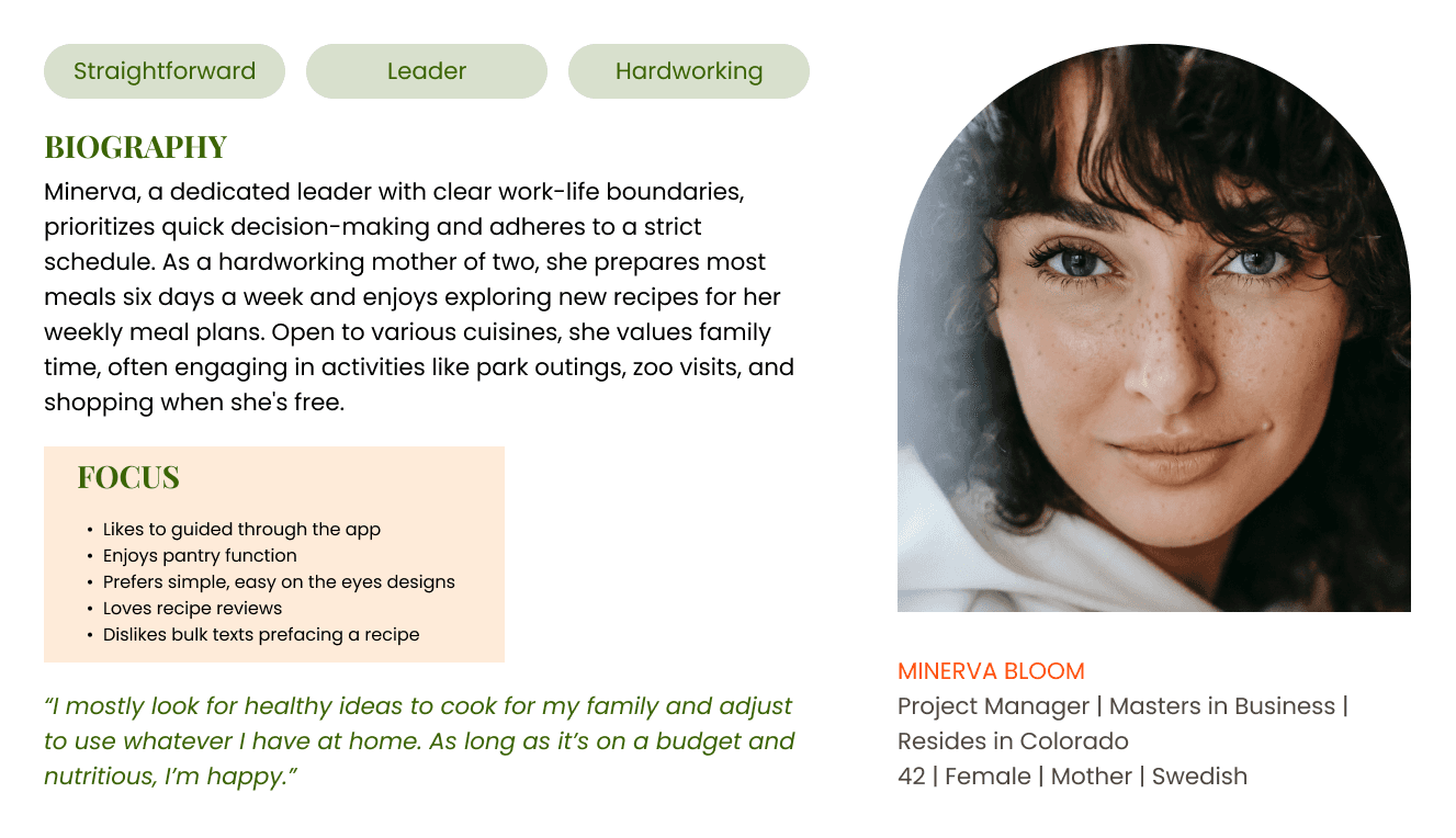
I started by running a competitive analysis and conducting user interviews to uncover the pain points of existing recipe apps. Users shared their frustrations—clunky navigation, lack of personalization, and confusing meal planning—and these insights became the foundation of my design approach. To truly empathize with my audience, I crafted user personas that reflected their needs and goals, guiding me to create user flows and wireframes that prioritized clarity, simplicity, and smart recommendations.
A target sample of three individuals were interviewed and asked a few questions over the challenges they encountered when looking for a recipe app. The following were the common frustrations and needs pinpointed in the user interviews.

Process
With a clear vision in mind, I started sketching low-fidelity wireframes. At first, I found myself overthinking each layout, slowing my progress. That’s when I adopted the Crazy 8s method—a game-changer that helped me generate ideas rapidly and break out of design paralysis. After running preference tests and gathering feedback, I confidently transitioned to high-fidelity wireframes in Figma, focusing on seamless navigation and user-friendly interactions.
To validate my designs, I turned to Usability Hub, running user tests to observe real interactions and pinpoint where users struggled. It highlighted areas that needed refinement, leading me to streamline flows and fill in missing wireframes. I also reached out to peers for their insights, revisiting my designs with fresh perspectives and new solutions. This iterative process ensured that every decision was purposeful and user-centered, resulting in a polished experience.


Key Takeaways
Enhanced my understanding of UX/UI principles, learning to design with user needs, client goals, and iterative improvements in mind.
Emphasized the importance of prioritizing the MVP features to focus development on core functionality.
Mastered responsive design techniques to ensure seamless user experiences across all device sizes, supporting broader accessibility and business growth.