Piggy Pouch
Goal
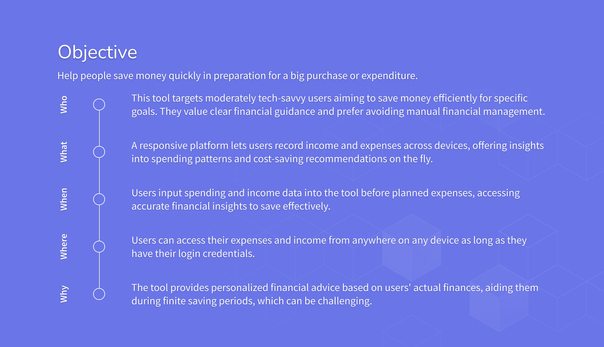
Create an app that enable average adults to save money quickly and effectively for their big-ticket goals or to repay loans and debts through a responsive, personalized platform.
My Role
UX, UI, Prototyping, Wireframing, User Flow
Industry
Banking
Client
Career Foundry Project
Type
UI Case Study
Date
2023
Overview
Context
In today’s fast-paced world, many people struggle to manage their finances manually while trying to save for a specific purchase or pay off debts. Piggy Pouch is a responsive platform that lets users record income and expenses across devices, offering clear visualizations and on-the-fly cost-saving recommendations.
Problem
The average adult often lack clear visibility into their spending patterns and personalized guidance, making it difficult to save effectively for finite goals or to prioritize debt repayment. Without a tool to consolidate financial data and motivate consistent saving or payment behaviors, people may overspend, fall behind on payments, or fail to reach their targets on time.
Solution
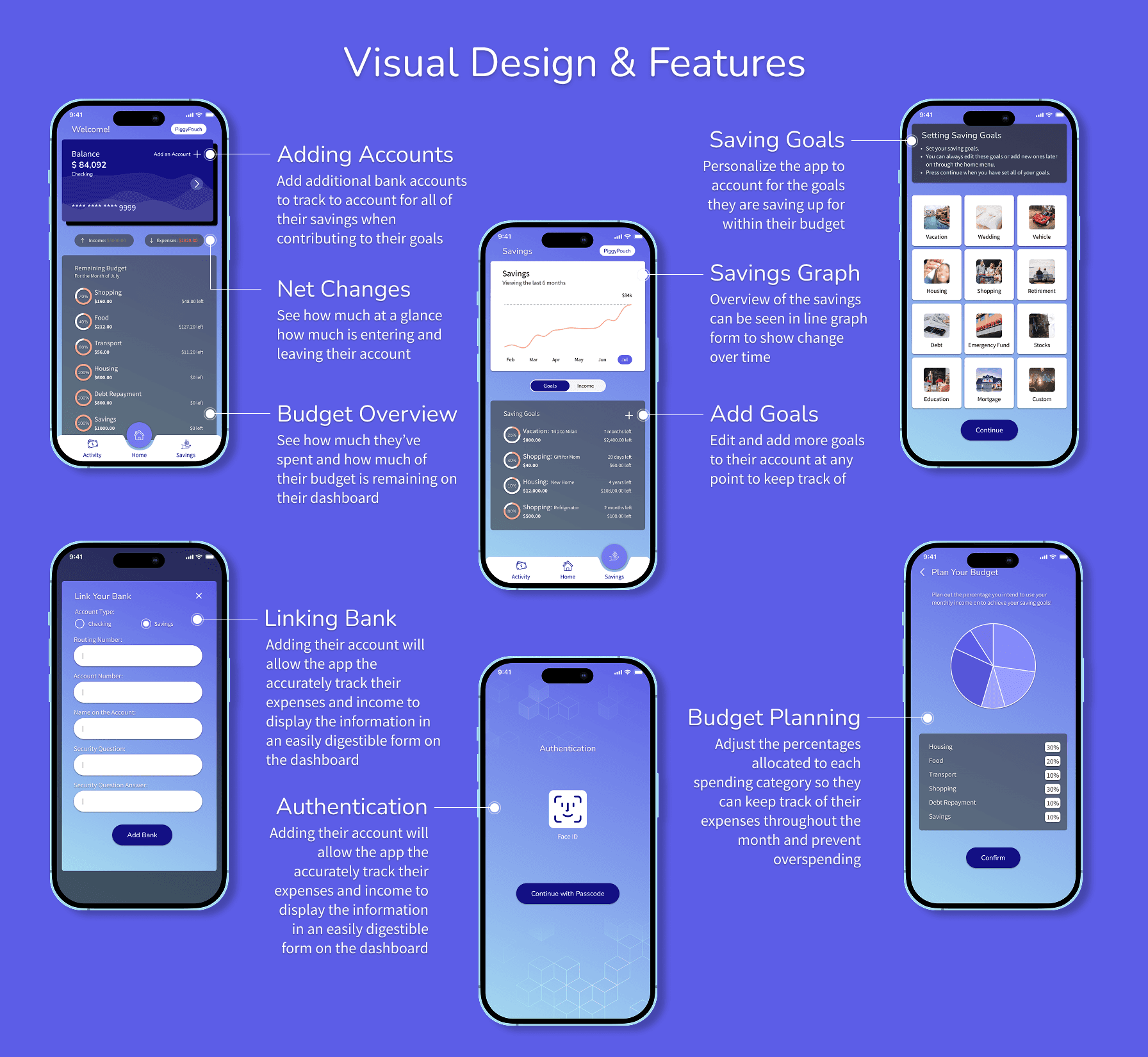
Piggy Pouch offers a friendly dashboard that visually breaks down income and expenses, combined with goal- and debt-tracking features that deliver personalized insights to keep users motivated. By providing real-time tracking and tailored cost-saving suggestions, the app helps users stay on track across their devices and feel confident as they work toward purchases, payoff timelines, or any defined financial milestone.
Research
Leveraging industry data on personal finance apps to inform every decision, it is noted that nearly 30% of users cite a confusing interface and lack of support as primary frustrations, while over 80% report that disconnected account integrations prevent them from getting accurate insights. With personal finance apps seeing only around a 14% 30-day retention rate and almost half of users deleting apps due to disjointed tools or missing features, I prioritized streamlining the dashboard and building robust bank linkage so users wouldn’t churn. By conducting targeted usability tests and iterating on wireframes. I focused on reducing cognitive load, tighten flows, and boost engagement.

Process
My process began by synthesizing quantitative insights with qualitative feedback to pinpoint exactly where users struggled—whether that was feeling overwhelmed by cluttered screens or frustrated by the inability to link their bank accounts seamlessly. I reasoned that by reducing unnecessary steps and presenting clear, digestible information at every turn, Piggy Pouch would not only address common pain points but also build trust and encourage consistent engagement. This meant mapping out each user flow, identifying friction points through usability tests, and iterating rapidly on wireframes. Design decisions weren’t just aesthetic choices but strategic moves grounded in empathy and measurable results.


Key Takeaways
Never assume , test: Usability testing reminded me that even tiny interactions can trip users up, and it’s always worth validating design decisions with real feedback.
Iterate with purpose: Quick, thoughtful iterations based on user needs helped me stay focused on impact over perfection, which improved both the user experience and my workflow.
Emotion matters in finance: When users are working toward personal savings goals or paying off debt, they respond to designs that feel trustworthy, encouraging, and visually motivating.